Diverse building blocks
CLIENT
Södra Porten / Fastighets AB Regio
WE DID
Logotype // Visual identity // Icon system // Signage system // Web design // Web content // Templates // Sales material
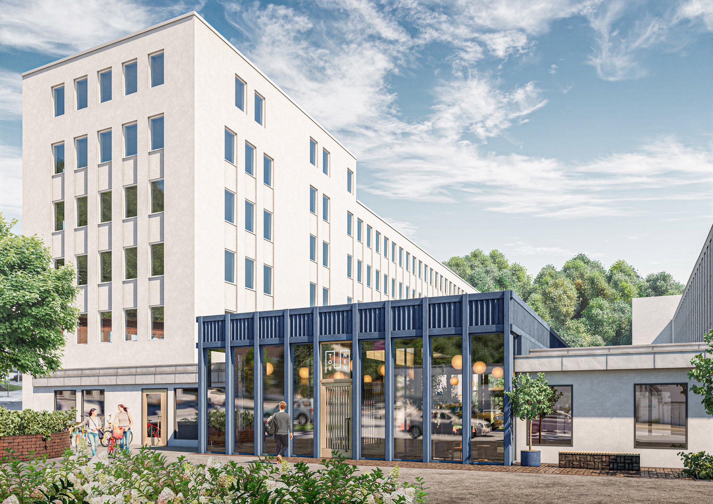
When Södra Porten, a commercial area in Mölndal, was becoming slightly run down, the owners had to decide whether to tear down and build new or renovate. They went for preserving and repurposing the buildings since it’s by far the most sustainable option. In close collaboration with tenants and Okidoki Arkitekter, the entire neighborhood is getting a smart and modern do-over.
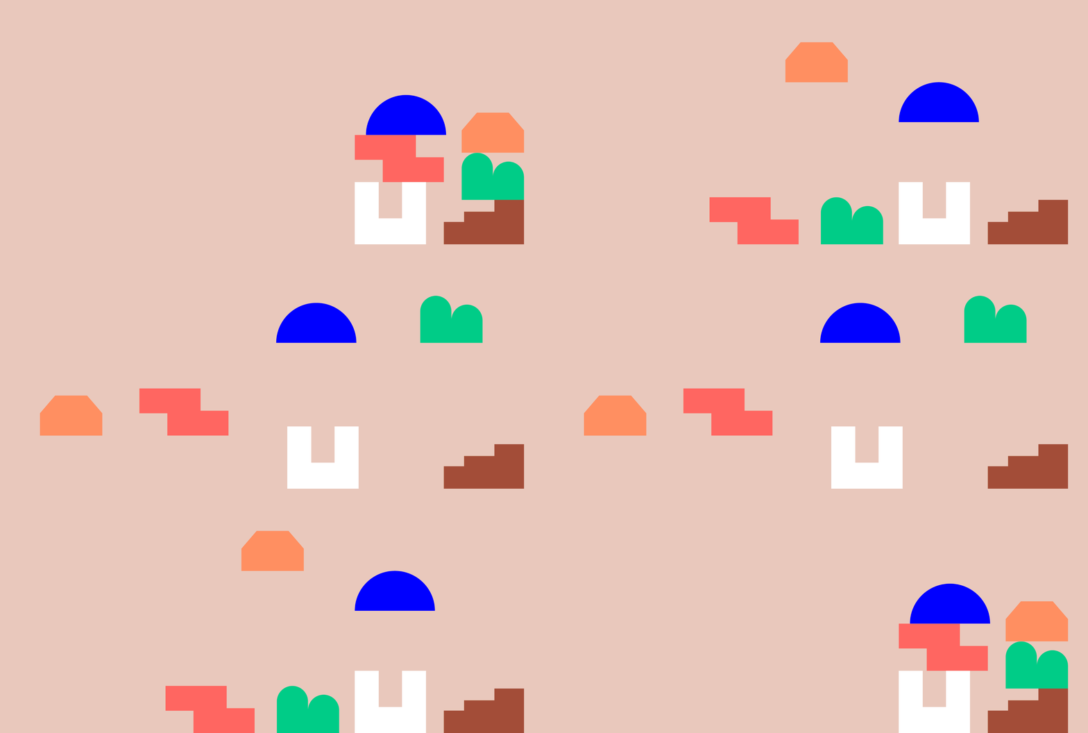
This also called for a new visual identity that reflects the exciting mix of diverse buildings. The differences were accentuated rather than played down. Each building was also given a name, a symbol and a distinct color. The silhouettes of all buildings were used as elements to shape a dynamic pattern. An updated wordmark, a blue main identity color and a new signage system keeps it all together.


Want to hear more about this project,
get in touch!
Contact:
Cecilia Backenfall
Email:
cecilia@pdgm.se
Phone:
+46 31 761 56 13
3D visualizations by Okidoki Arkitekter


